 The Land of Stories by Chris Colfer…I just have to recommend this series. This fairy tale retelling (and filling in some blanks) is fantastic. The backstories of the fairy tale characters are so well developed; it makes me wonder if Colfer did not rewrite all the old stories to prepare for this series. I am currently devouring book two, relishing the pure adventure the twins Alex and Connor are experiencing. It is remarkably easy to fall into the pages and lose track of time as the story moves at such a quick pace, with such danger and I especially have to give credit to how human and real Alex and Connor are. Sure, they have adventures, but there is a cost and that cost leads to regret. Colfer is not shy about writing this regret and sadness into his books and I value this as a reader. I am nearing the final pages of book two and every page makes me more and more excited to finish this series. There are currently five books in the series; The Wishing Spell, The Enchantress Returns, A Grimm Warning, Beyond the Kingdoms, An Author's Odyssey and the sixth book, Worlds Collide, coming soon. I am very much looking forward to the release of his final book in the upcoming months!
0 Comments
 A witch-hunt in the world of children with magic balanced as the problem and solution. J.A. White authored an amazing fairy tale, three previous books, filled with intense emotion. I have been anxiously anticipating the final book for nearly a year and I devoured its pages with my eyes. The story follows a brother and sister as victims of a witch-hunt that turns into a mistake that could end the world.
The final installment, released early April 2017 is an amazing and unforgettable conclusion to this series. The dark, scary, fast-paced action is full of twists and turns and the “Last Spell” is one that you just cannot forget. The imagination from J.A. White is immense as he creates a world, beasts and a story set at a new level, securing him a spot on my favorite authors list.  There is so much good material here, where to start? The first book in this series is full of accidents and accented with grisly murders. Set in the 17th century era of King Charles II, it has a unique sense of curiosity. The book, written from the perspective of an apothecary masters apprentice, Christopher, from a strict orphanage and telling his story up through his first few years of apprenticeship. Even though the characters are set in the 1600’s, this gives it a lot of relate-able material for the younger generation while appealing to an older generation through the bonds in which Christopher makes.
Kevin Sands tackles integrating chemistry concepts in a fun, appealing and explosive way into his story. Much like chemistry, the story mixes elements of friendship, parental love, religion and growing up to create a concoction that is truly rewarding. The way in which Sands lays these elements into the story as concepts within mysteries and riddles within codes has definitely created a niche story element that keeps a captivating pace throughout. I have yet to start the second book in the series, but I am definitely hungry to read where Sands writes Christopher next. Without giving the ending away, there are some devilish twists that leave several loose threads! This post is to address a professional aspect of librarianship: teaching. I have some great management and support at my university; so with some professional instructional help, I have come to settle on this model for developing workshops and lesson plans. It is simple and straightforward so that students can easily digest the information quickly. The following outline is going to use my Infographics: Piktochart & Canva lesson. As a side note, the section on “Teaching Piktochart & Canva” has a dual purpose as we have Education majors at our university and I present at conferences on this topic. Present the topic
 What is an infographic? Information graphics or infographics are graphic visual representations of information, data or knowledge intended to present information quickly and clearly. They can improve cognition by utilizing graphics to enhance the human visual system's ability to see patterns and trends. I will be talking about some basics on infographics, how I learned and now teach these programs followed by some basic design principles and then offer some more resources before providing a quick look at Piktochart and Canva.
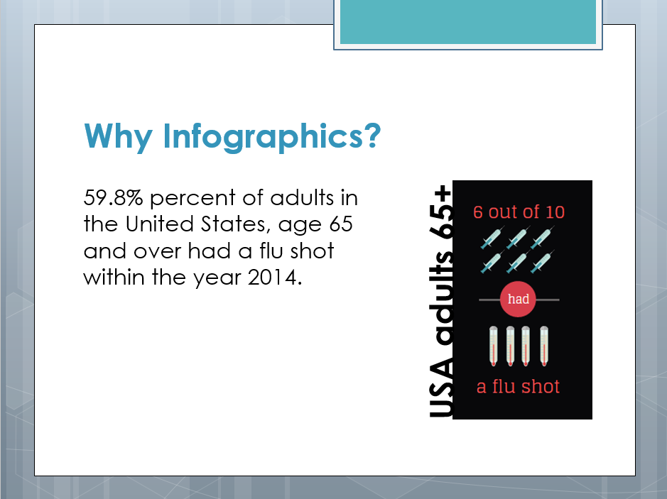 We are visual creatures: 90% of the information transmitted to the brain is visual, and that is processed 60,000x faster in the brain than text. (http://www.nngroup.com/articles/how-little-do-users-read/) The general public has an increasingly shorter attention span; we tend to “scan” material as opposed to actually reading text. “A picture is worth a thousand words” Infographics have the ability to dissect a complex subject, and the ability to sustain the attention of readers while doing so. Infographics help cover “heavy” topics in an enjoyable way. Infographics can easily export to posters, papers, brochures and leaflets. Deliver the tool Present the tool to accomplish the main goal or learning objective. For this, I try to offer something that can speak to different learning styles: Visual – Offer them some tutorial videos to follow along and learn. 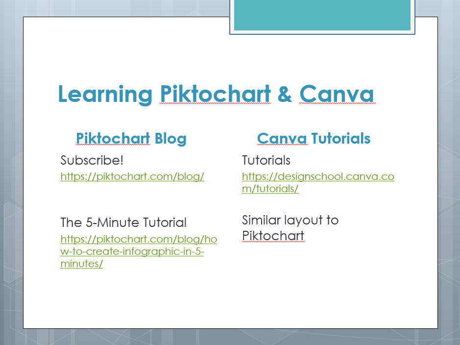 Piktochart can subscribe to the Piktochart Blog Sections on Latest posts, culture, design, education, marketing, popular and updates Searchable Canva has a Learn menu with Tutorials on a range of functions; Advanced Tips, Backgrounds, Branding, Color, Fonts, Getting Started, Images, Layout, Shapes and Icons and Skills in Action 30 total, easy and interactive with both hands on and video Online courses specific to creativity and branding (Social Media coming soon) Reading – Show them where to find the help topics to read. 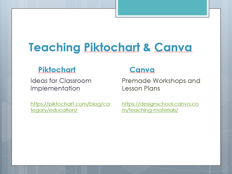 Piktochart has an education section of blog Collaborative classroom integration How to use Piktochart in any classroom Using infographics in a flipped classroom Visual literacy Canva 4 premade workshops with accompanied lesson plans 1. learn Canva 2. fonts, colors, images 3. backgrounds, shapes and layouts 4. branding basics Hands-On – Provide them a quick demonstration. (I save this for after the presentation). Design Tips With this particular topic, I provide three easy designer tips, showing an example and telling the how it is helpful (VERY briefly as to not overwhelm). 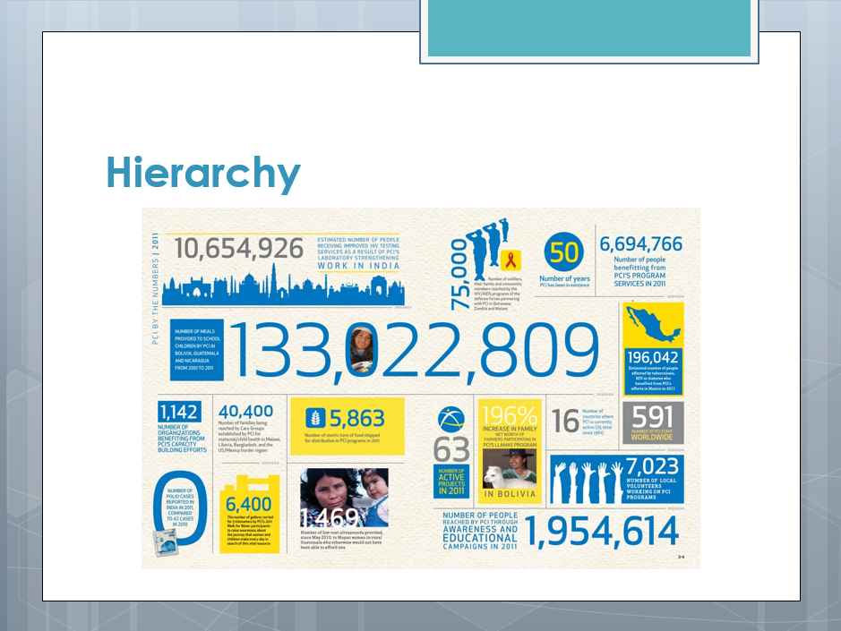 Hierarchy – Use a visual hierarchy to help the reader pick out the most important information. Our brain is trained to make connections between objects in our surroundings – if one object is bigger or bolder, our brain assumes it’s more important than a smaller one. In design, we use fonts, sizes, and visual elements to create the illusion of hierarchy between elements in a composition, and show readers what has more relevance. 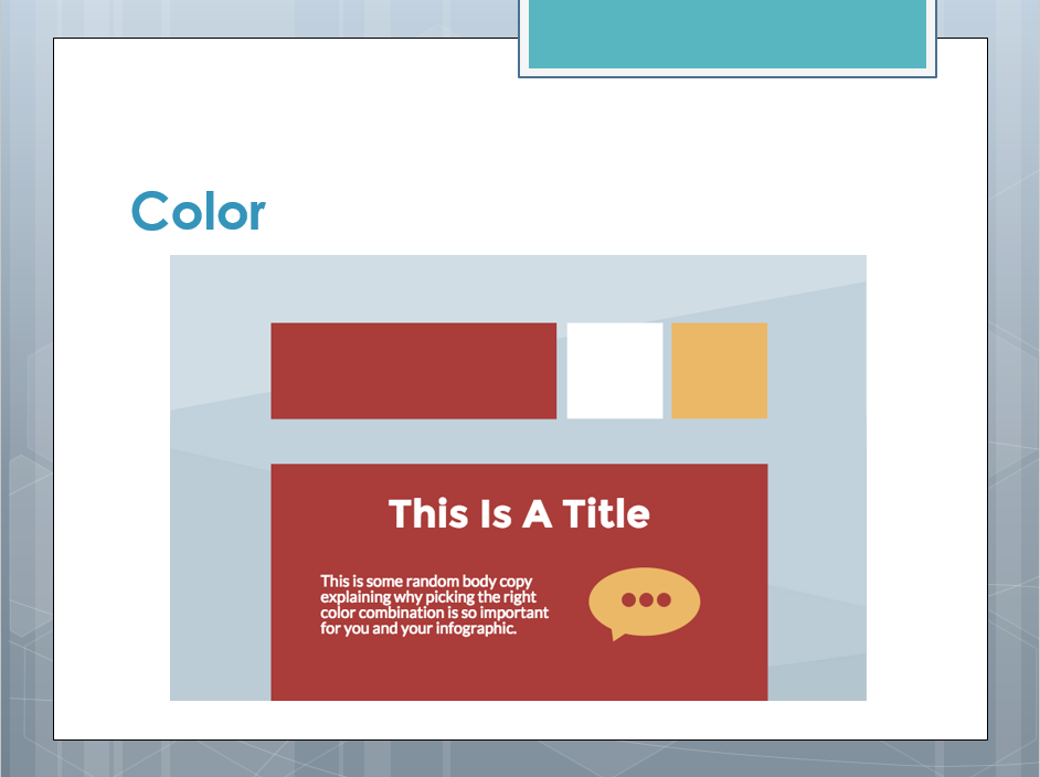 Color – The colors you use in your design convey the moods and highlight important sections of your design. The rule of 3 colors - A super simple tool you can use whenever you are in doubt. You cannot go wrong with it. The rule of 3 colors is simple: pick one primary color. Then, pick two other complementary colors. 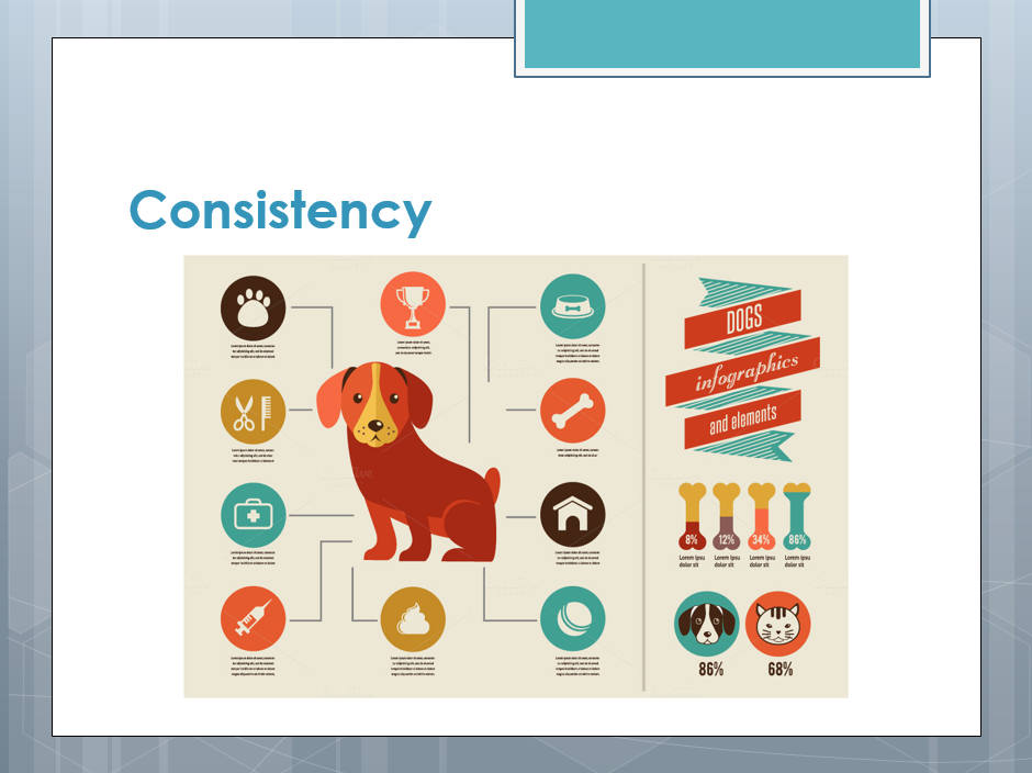 Consistency - Do you know what the key to Starbucks’ success is? Every time you order a latte and a blueberry muffin, you get the same experience. The same principle applies to graphic design – for a design to be compelling, all elements need to relate, work well with each other and be consistent. Wrap It Up Provide them any additional resources: data, where to find the presentation, how to get in contact with you and other free goodies before moving into the demonstration.  This presentation is listed in a libguide: http://libguides.shadygrove.umd.edu/infographics. There are a lot of different resources available. In this resource, we have compiled lists that offer multiple infographic software's, font sources, icon & image sources, color tips and some select data sources. The majority of these resources are all free. We encourage other libraries to use this resource!  As you know data can come from a variety of sources; including you (data you collected), government agencies, non-governmental organizations (NGOs), other researchers, journal articles.  My contact information if you have any further questions or would like to schedule a meeting for some one-on-one guidance. Assessment Time!
ii.Here are other ideas for different lessons:
 The Story Behind the Idea Currently, the USG Priddy Library website only contains a short piece written on the library’s history found in the “About the Library” tab. It explains the library’s history since 2007 and mentions the library’s partnership with Montgomery County Public Schools. The many avenues that the library has participated in outreach and developed partnerships in the community are not covered through this approach. 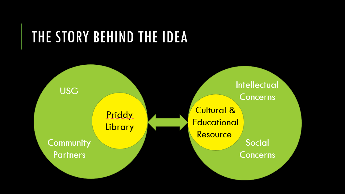 In 2009 the Library Director was charged with “working collaboratively and in partnership with USG and community partners to advance the Priddy Library’s distinctive role within USG by advancing its position as a cultural and educational resource highlighting topics of intellectual and social concerns”, this directive came verbatim from the Executive Director of the institution. Fast forward to mid-2014 when I joined the library team. We began to discuss how we could better represent the library’s history of partnerships and outreach and decided to use an interactive timeline, which allowed the general public and stakeholders to engage more actively in learning about our impact. To do this, I decided to use ArcGIS & Story Maps, and I will share what we have so far, which includes pictures, maps, text and interactive features that allow the user to move easily across a timeline while visualizing the outreach and partnership data.  Value in Narrating Before getting into more of the specifics about this project, I want to step back and talk about some things to keep in mind when creating visualizations, and the importance of using visualizations to tell a story, not simply for creating pretty charts and graphs. Technology and access is advancing knowledge of analytics and visualization tools are becoming more valuable; along with this, there is a need and value to narrating. From bar and pie charts to tables and line graphs; these methods focus on data representation, not on aiding a narrative. 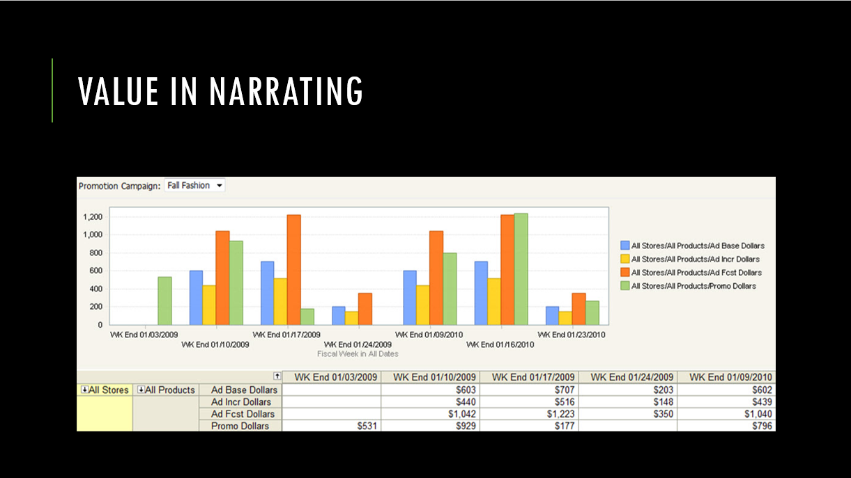 The example I would propose of data representation that lacks a narrative has been presented by Harvard Business Review as “using scanner data to track what happened at the point of sale.” (Gavett, 2014) This collects just the pure data which is visualized as products sold within a given timeframe. Retailers have no idea what’s really happening at a point-of-purchase decision and to get to this you need a narrative. 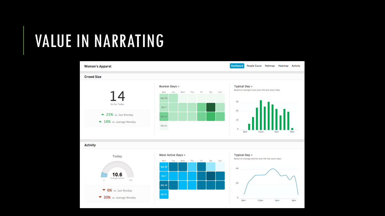 With the use of a narrative, a visualization can be expanded to tell the story of that purchase decision. With new technologies like location analytics we now have the ability to map in-store customer behavior; tracking the movement of a store’s customers, aggregating this data over a period of time and then identifying patterns. This turns a store floor into an analytics narrative – the story of what’s happening at a point-of-purchase decision. What can this type of analytics narrative tell us? 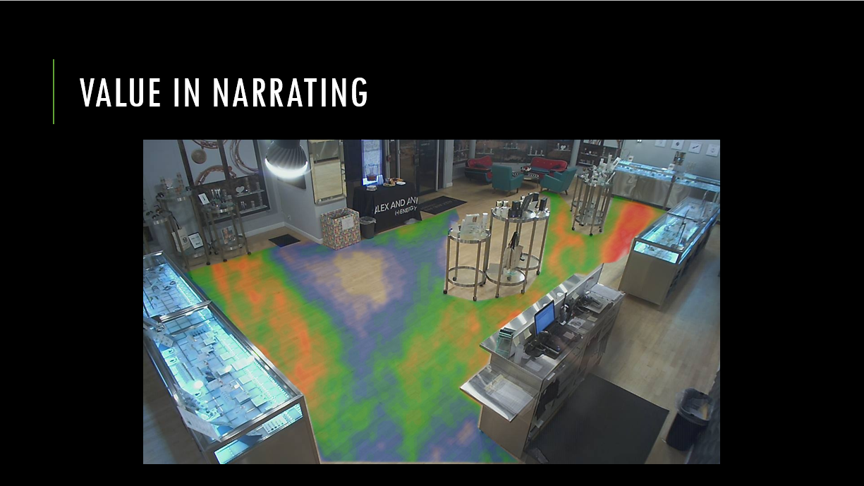 This analytic narrative can tell a story about a certain area people are drawn to more often or which way people turn when they first enter a store. In the Harvard Business Review article, Greg Yin says, “collecting and visualizing this data has helped his company test out in-store assumptions quickly.” (Gavett, 2014) And the narrative can be especially worthwhile when it comes to maximizing the importance of staffing. In this example the narrative can help decisions on product placement, as a “slower-moving product can be moved to a more trafficked location, resulting in an uptick in sales.” (Gavett, 2014) It can assist in store development by shortening planning times and providing quick test phases, as “the industry cannot invest 12 months in a long research project because the technology will have changed by then.” (Gavett, 2014) And it can benefit the way in which we approach our customers by “making sure customers have a person to assist them, easing the burden of the busiest times on associates.” (Gavett, 2014) Can you see how this relates to Arts & Humanities? Using the same technology: location analytics, we can tell the narrative of how individuals appreciate art, ensure guests have someone to assist them in a museum or relocate art in a gallery to position it better for sales. There are other technologies too, such as eye tracking analytics that could be used to analyze how individuals perceive a painting or sculpture, where their focus is initially drawn and how they view the overall piece. 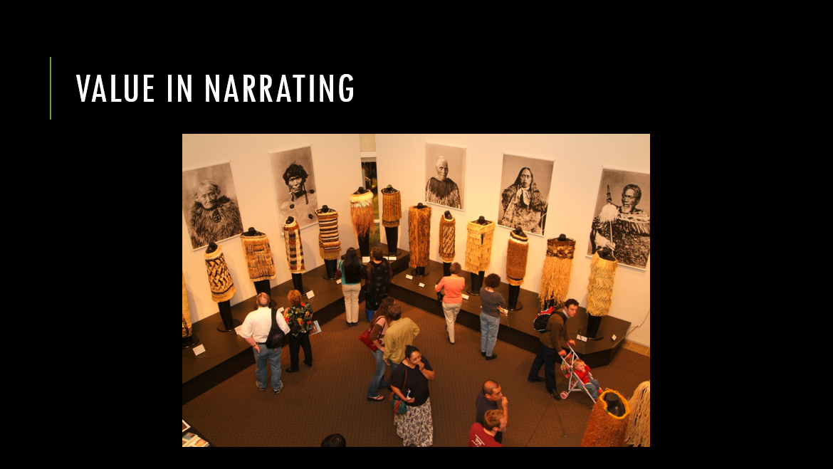 These are just a handful of relations; I would add to this by saying that finding the story behind data is significantly more difficult than crunching numbers. The amount of data and data types is astounding, it makes experienced analysts the professionals who can separate what is useful or valuable from what is not. For this reason, finding the right data and the right way to narrate it is much like developing an art show. 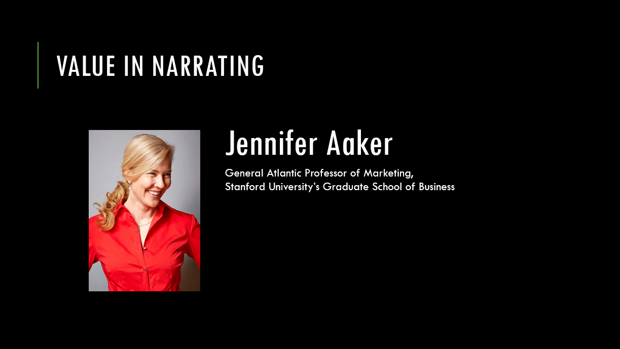 Jennifer L. Aaker, Professor of Marketing at Stanford, is an authority on speaking about the value in narrating. Her idea is that data is meaningful when we narrate it in a memorable, impactful and personal way. She demonstrates this in her presentation “Persuasion and the Power of Story.” Jennifer touches on examples that highlight the way individuals react to information; where 5% of students recall a statistic and 63% remember the story, summarizing that “Stories are memorable in a way that statistics are not.” (Aaker, 2013) When she talks about impactful data; presenting a story of data about a child in need versus simply the statistics led to nearly double the donations from study participants. This alluded to the idea that rather than logic, emotions drive our decisions and we rationalize them afterwards. Finally when she talks about connecting personally to data she simply states that when viewing data we are capable of understanding but not feeling statistics, however when we share data through a story we establish that feeling and, thus, create a personal connection. She goes on to say that, “When a story is well told, they are able to feel connected, not just to the story but to the storyteller.” (Aaker, 2013) This holds true for our stakeholders and the public when we connect with them through narrating our data in a memorable, impactful and personal way they can then see the value of our partnerships and outreach. 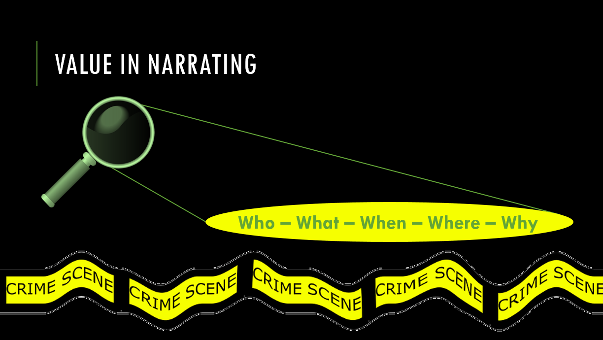 With Aaker’s comments in mind, there is good news. That is that data analysis isn't all about graphics and visualizations; it's about telling a story. When you look at data, try to see it the way CSI investigates a scene. Look to understand what evidence needs to be collected and the larger picture of what happened. The visualization; whether it’s a map, graph or even a single number, will emerge once the investigation is complete. 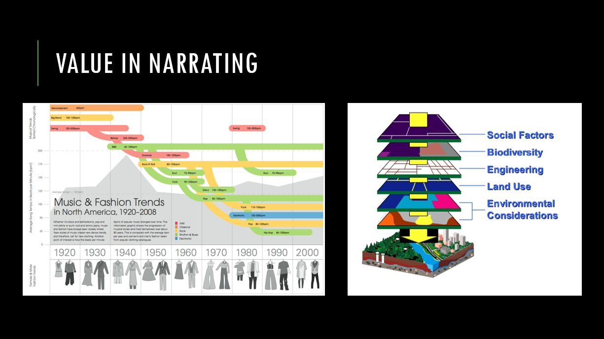 An effective and successful visualization has two key components. First, if taken out of context, it stands on its own and the audience should still understand the message because the visualization tells the story. Second, even though too much interaction can be distracting, the visualization should integrate a layered data approach so the inquisitive can investigate. Narrating your data can do all of this. I tried to follow these guidelines in developing the timeline of our library’s partnerships and outreach history.  Why ArcGIS & Story Maps In early 2015, I began work with my interns on a search for potential platforms in which to visualize our library’s historic partnership and outreach story. Through developing the project proposal we discovered the need to visualize our data geographically and with date specific points of interest. A major inspiration was found on Duke University’s historical timeline which included an interactive element. We built from this concept and felt that the addition of geographical aspects would help to convey the growth and importance of the Priddy Library’s outreach and partnerships. We found tools that would dynamically present information; however we also found they were limited by that same function; such as lack of customization, few options and pages being too static. It wasn’t until our Health Sciences Librarian, who taught herself ArcGIS & Story Maps, introduced me to this platform that pieces began to fall into place. I began work on a test model using ArcGIS & Story Maps which allowed for our story to be told in the way in which we envisioned.  ESRI, the producers of ArcGIS & Story Maps technology, creates map and story map applications with templates which are continuously being updated. ESRI has also been recognized as a leader in the GIS industry. Templates serve different purposes and narrative models; for example, progressive built stories, maps and story maps that are time line or route dependent, or selected point of interest and comparison maps which are based on overlays and can change by use of a slider. Some of the positive aspects I’ve come to appreciate about ArcGIS & Story Maps include that it has an easy learning curve, no mapping or coding skills are required. You have the capability to download apps & story maps and run them on your own server. If you do, there is Source Code which can be found online to tailor a downloaded template and modifications with Java Script are possible. Maps are in high enough resolution for viewing on both monitors as well as on mobile devices. It is free to use online with a user account and comes with a broad selection of templates for creating different geographic and story maps. The one drawback is that for a subscription it uses a credit based system; if you need more assistance or want more features it requires you to purchase credits and apply them for these services. 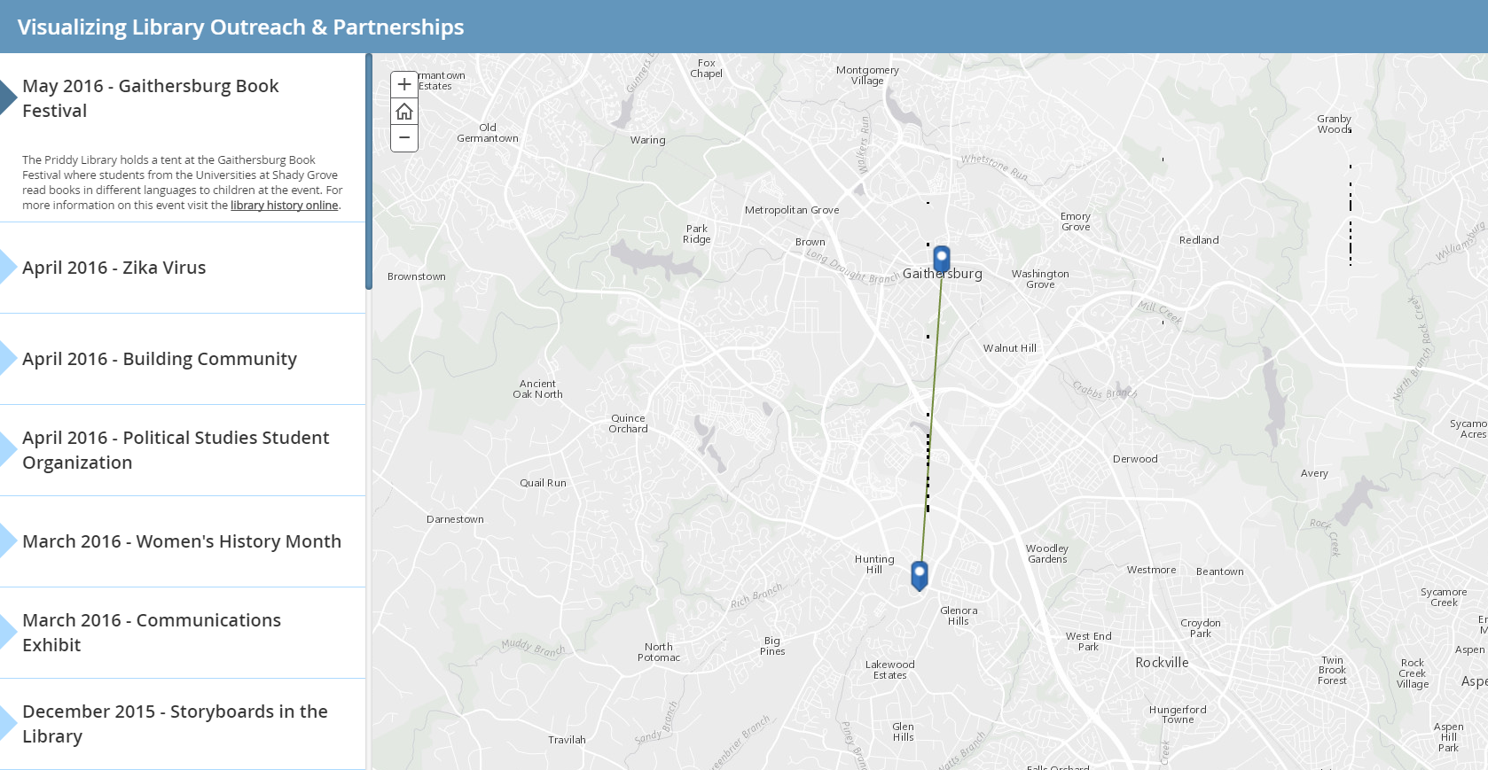 The interactive visualization
Few libraries have presented their histories for the public to study. By learning from and building on those who have, the Priddy Library can have this unique aspect become part of all that it offers. This project allows the public and stakeholders to gain a better understanding of the library’s history and its role within the USG community. The interactive timeline map serves as an easy to use platform that captures the narrative of the library’s partnerships and outreach. Without further delay, here is a peek at our current project. http://arcg.is/2dhtMgX Works Cited Aaker, J. (2013, September 14). Persuasion and the Power of Story. Retrieved from https://www.youtube.com/watch?v=AL-PAzrpqUQ Gavett, G. (2014, May 9). How Data Visualization Answered One of Retail’s Most Vexing Questions. Harvard Business Review. 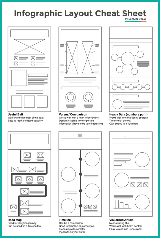 Part of my experience within the libraries I’ve worked for is in partnering with different programs, students and interns to create educational exhibits. I can recall how each thought that the process was simple, but quickly learned that it can take several weeks to construct one. Whether I’m working with a professor and their class over an entire semester, or simply teaching a handful of students from a program; I have had the wonderful opportunity to establish my own systematic approach to producing an exhibit. It seems like a lot at first, but with practice it becomes easier or others are welcome to adapt it to their own needs. The logical first step is in picking a topic. This can be done in several ways; for example, surveying students to find out what interests them, looking at current issues, asking programs what their needs and focuses are. It’s not a bad idea to also look at common observances for filler exhibits; such as, Women’s History Month, African American History Month or Asian Pacific American Heritage Month. After a subject is selected I typically divide the efforts here with the majority of the energy being placed in locating information resources for the exhibit. For sources, we typically look at what government sites have compiled information wise or reach out to the experts; for instance, university research specialists, Library of Congress information professionals or museum experts. This is helpful as it may uncover search terms or hidden facts that we had not previously known. Once we have gathered our information we synthesize our research and condense the information to be as brief and accurate as possible, which can take a lot of time and editing. Even as we are locating, producing and editing our content for the exhibit, I simultaneously attempt to discover inspiration for the overall layout and design. One of my favorite places to search for brilliance is a site called Designspiration and I recommend it highly. I normally take about 2-3 ideas and combine them for my design, considering layout, color and text. There are other useful tools published by Piktochart and Canva that I keep on hand, this layout cheat sheet: And also this complimentary font document showing the font names (which can be downloaded free at FontSquirrel) and then an example of use. (Due to upload limitations, the file is broken into 4 parts.)
There are other components to consider for the exhibit, mainly interactive factors. Things I like to ask the group working with me is if there are:
I keep my color scheme simple and it goes a long way, limiting my colors to 2-4 colors. I make another recommendation here to use Adobe Color CC for an easy palette with options for analogous, monochromatic, triad, complementary, compound or shades of colors. This is helpful in creating contrast within the exhibit such as a light background and darker text to increase visibility, but keep in mind your images need to stand out too and not blend into your palette. Images for your exhibit are tough to find, but it can be done! If you find images that are under copyright be sure to get permission to use them. There are lots of free sources for high quality images: Flickr Creative Commons, New York Public Library Digital Collections, Pixabay and Wikimedia Commons for some examples. After your exhibit is done, I strongly recommend at least 2 full reviews by someone other than yourself and allowing yourself about a week for printing. When you are ready to hang your exhibit, I advise that purchasing some reusable banner/poster rails (Displays2Go) which come in a variety of sizes and finishes. Marketing the event is usually done right after I submit the project to the printer, using our established marketing and outreach plan and selecting from the created matrix which marketing options I would like. During the marketing of our Fighting Zika exhibit and panel discussion, the recommendation came that our exhibits should have an online presence, which at the time we were able to setup a live webcast of the panel. I have been working with an intern for nearly a year on creating an archive for my current library to help visualize the outreach and partnerships using the open source program Omeka. We are hoping to launch this project sometime during the Fall of 2016.  What I have learned over the past years is that marketing and outreach can be organized into an effective plan. In my current position, working with a team, we began our plan by creating a matrix of marketing outlets to select from. The purpose of this was not to utilize each marketing and outreach channel, but to create a broad range for the event organizer to select from. The first step in our plan is for the event organizer to draft the language and advertising to be used for distribution. This is important so that the information distributed is all uniform and circumvents errors in relayed event details. A few suggestions in creation of advertising: I would suggest the language cover the who, why, what, when and where. This might seem obvious, but it is the essential details that can sometimes easily be overlooked. Use a readable typeface, a good thing to keep in mind is that promotional material may be printed in ¼ sheets as handouts. Be sure that the message can be read at this size. Limit your use of colors and get creative. Like purposefully misusing it, one of the most clicked advertisements I’ve created was in bright pink, blue and maroon. Limit the formats you create for: Social Media posts 470x394 pixels, TV ads 1920x1080 pixels and 8.5”x11” which is 612x792 pixels. I would also recommend that your 8.5”x11” is created to be scalable to both a larger 18”x24” poster format and a ¼ or ½ page handout. We broke down our headings into Venue, Contact Person (for the venue, if known), Library Contact (who is responsible) and Timeframe (when to reach out, if known). We began with the most important first step, the blurb about the event and made that the responsibility of the event coordinator. Being a team, this does not leave the event coordinator without help in editing and feedback in creating the advertising and language.  Next we looked at internal channels of communication, what we can do within our facility to market the event. For selecting who was responsible for which task, we relied on who already covered the essential functions. For example, the Library Staff whom maintain the website and public computer screensavers were automatically assigned the responsibility of updating these marketing avenues. 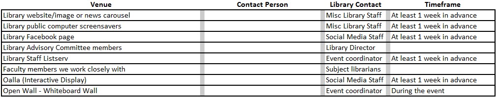 Social media was the next opportunity that we tackled. One of the best ways we are able to collaborate with other departments in social media is by sharing posts. Responsibility is again reflected in who presently covers the role. We discovered that several departments have their own social media outlets and not all the same. For example, our Library has only a Facebook page, but no other social media sites – by collaborating with our Office of Student Services we are able to reach a broader audience through them sharing via Twitter, Flickr or LinkedIn Alumni Groups and we, likewise, share their posts on the Library’s Facebook. 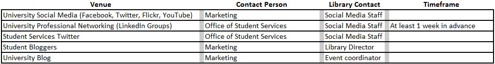 From social media we turned back inwards and created a matrix of email listserv’s, newsletters and student meetings. This is a tricky method of communication as cross postings and speeches can occur. In some cases, email servers can flag you as spam or you end up annoying your audience from multiple email messages. Accountability here was more based off whom had the better working relationship with each venue. 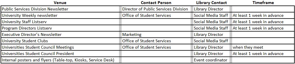 We also considered other internal technological outlets that we could utilize in our efforts and created this list: 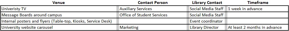 After we exhausted our internal avenues, we considered outreach to the community. We tried to consider outreach locations the community often visit and message or announcement boards were commonly found. 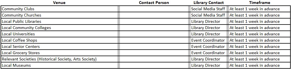 Once the matrix is completed, it provided us with an overarching marketing outline that the event coordinator could then pick and choose from. After using this matrix tool a few times, what I have found more effective is when contacting people, to make it feel personal rather than a blast email. Taking that extra step and effort in contacting and using a name in combination with a snippet on how it is relevant to the contacts group or demographic is usually more effectual than simply sending a notice. It’s a simple comparison of which an individual would feel more attracted to attending: 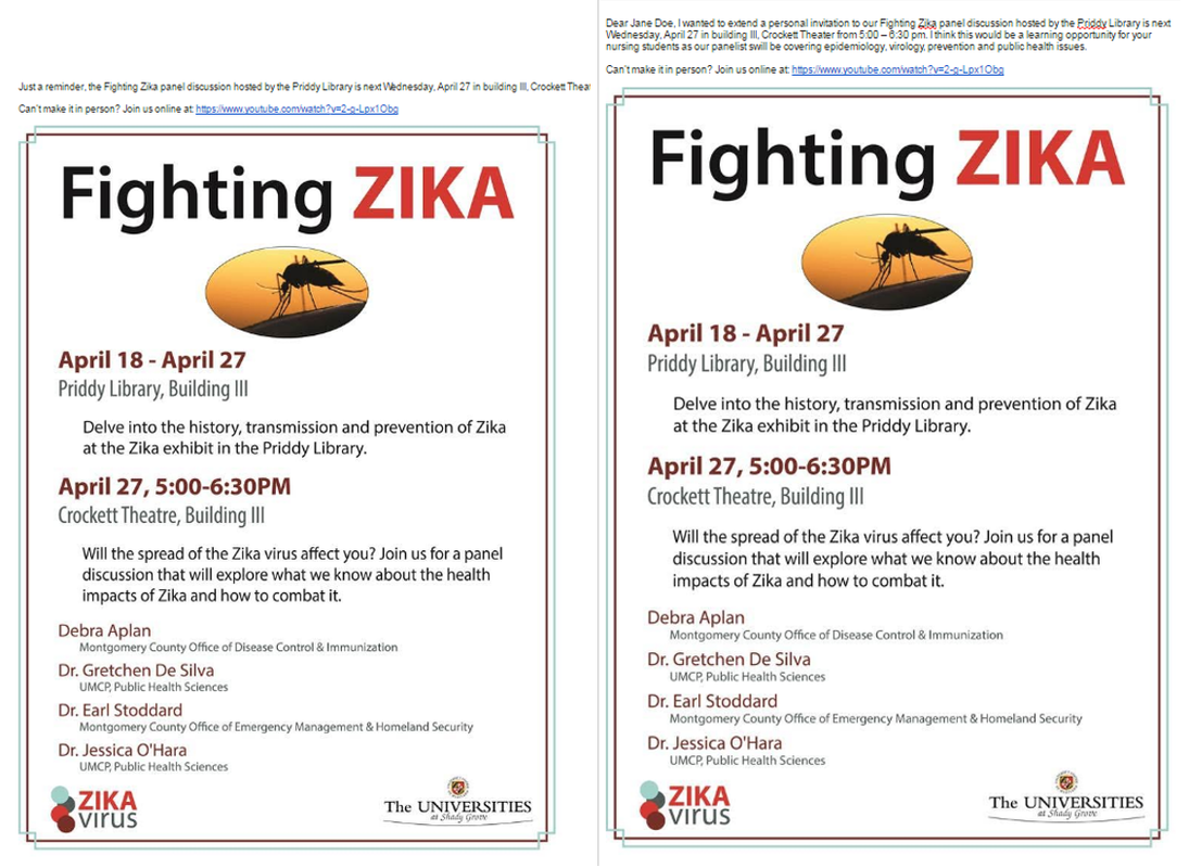 Right: Simple email blast with event information. Left: Email addressing individual relating event to nursing students (epidemiology, virology, public health and disease prevention). To sum it all up:
After many years of creating educational, program focused exhibits in my current and past libraries, I wanted to give a brief outline on the process and how my Personal Information Management (PIM) style has rounded out this process. It took many exhibits to tailor my PIM to what it is today, learning by mistakes and failing. In the beginning I had never planned for the archiving of an exhibit or even a web presence, I feel that this is a loss of information in that I could have maximized the exposure for better feedback from the start; therefore I lost the feedback information. I did create a Pinterest account and pinned them to a “Library” board in hopes of helping others in the library community who might search for inspiration. The following is my tailored PIM for working with educational programs to develop library exhibits. Input
In the beginning it was difficult to collect and keep the research organized in a useful way; currently my system is to look at (pre-factors) what led up to, (central focus-factors) concepts dealing with the main topic and (post-factors) the impact or repercussions afterwards. When I first began researching topics I would cast my net wide, too wide in fact, and then have a lot of extra information that was unnecessary. This had to do with taking too many photo’s or collecting too many notes, documents or books that related to the subject. I highly recommend developing an exhibit format (for example, pre, central focus and post-factors) to collect information for versus collecting the information and then developing an exhibit format. Creating the marketing plan is also where I met some challenges with information storage. Outreach to the communities that would have the most impact; I feel this could be another PIM within my PIM. Identifying organizations (youth groups, churches, libraries, schools, etc…) and retaining contacts within them could be seen in the following form. Input
Just be aware that Storage (Organization) within this subset is challenging as contacts change through various means; such as contact is promoted and no longer disseminates information or contact has moved to another place of employment. The final output of exhibits is up to the individual, I have found that scroll banners work well for educational poster exhibits. I typically work in a 2' x 4' format and use clear banner rails to hang them as they don't interfere with graphics, come in various sizes, are very budget friendly and are highly reusable. |

librarianAfter several years of direct library experience I wanted to create a space to provide my two cents on librarianship, chronicle my lessons learned and share some insight. 
Archives
July 2017
Reading Recommendations:
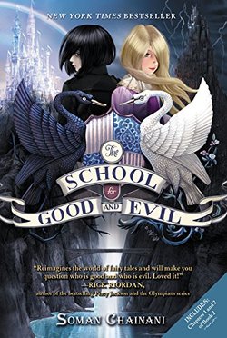
The School for Good and Evil by Soman Chainani
This series focuses on making the reader question what is good and what is evil, can you do evil in the name of good or can doing good be evil? When a good and bad girl get swapped in their schools for becoming a princess and becoming a villain, things start being put to question really fast all in the pursuit of their "ever after". The best part is the weaving of classic fairy tale characters into this epic trilogy, they fit into the story perfectly and added a whole other level of questioning right and wrong ethics. 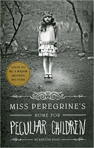
Miss Peregrine's Home for Peculiar Children by Ransom Riggs
This dark trilogy weaves European history into a fantastic story of a small town kids self realization and acceptance. It has a fast pace with lots of action and I appreciated that the darker side of this story was not sugar coated, it had me on edge the whole time! 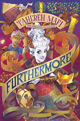
Furthermore by Tahereh Mafi
Prepare to have your imagination blown away by this immeasurably creative adventure where magic is based on color, but what happens when a girl is born with no color? This story deals with being a complete outcast of society, being ridiculed and finding ones own self worth. I seriously hope there is another book coming by this author as imaginative doesn't even contain the world that Mafi created in this story. 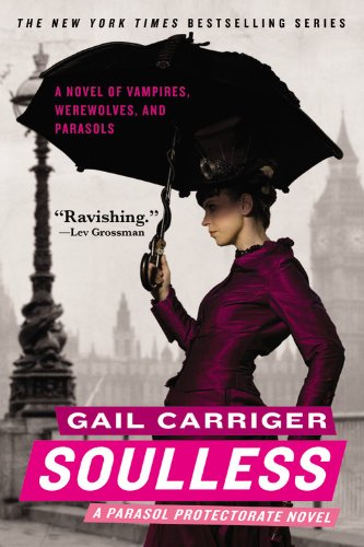
Soulless by Gail Carriger
Another good author friend of mine, Gail never fails to impress with her writings. She comes from a humble background in archaeology and with her strong female lead character Alexia she writes a supernatural steampunk story that is sure to captivate as Alexia struggles to find her way in a society that just doesn't want to make room for her or her strange powers. 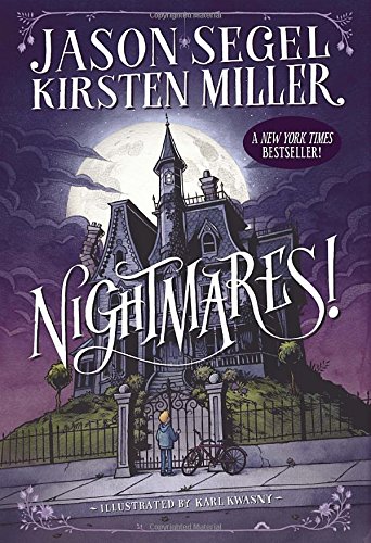
Nightmares! by Jason Segel and Kirsten Miller
It is hard to put this series down for sure, the story focuses on a young child dealing with loss, depression and of course his worst Nightmares! This series is an easy read, but it really captures the perspective of how a child deals with these issues. It is a brave series to say the least. 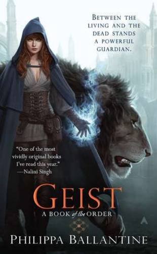
Geist by Philippa Ballantine
A friend of mine, Pip writes a strong female character in this fantasy series that puts her character Sorcha smack dab in the middle of the worlds of the living and the dead. A series that was difficult to put down, but also one that I with there were more of. It is difficult to find a fantasy so well written and empowering of a lead female character. I love Pip's ability to capture all of this. 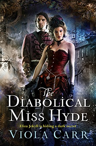
The Diabolical Miss Hyde: An Electric Empire Novel by Viola Carr
Ok, seriously, things could not get more exciting with this steampunk story about the famous Dr. Jekyll's daughter Dr. Eliza Jekyll and her investigation of the "the Chopper" murderer. Carr crafted a fast paced thriller that twists the ending so much...well you'll have to read it yourself to find out! 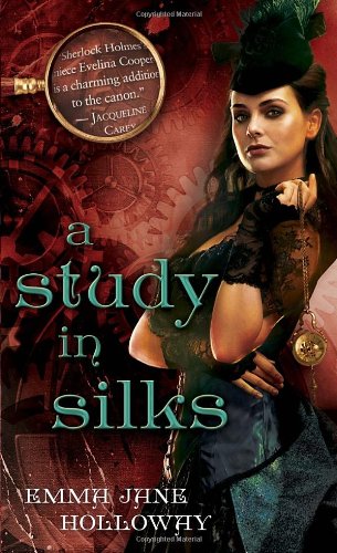
A Study in Silks (The Baskerville Affair) by Emma Jane Holloway
Evelina Cooper, she is the niece of Sherlock Holmes. This is a steampunk masterpiece that has just about everything: magic, machines, secrets, crazy action, and all the thrills one expects when love and fear come crashing together. Emma Jane impresses me with this series beyond measure. 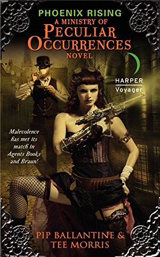
Phoenix Rising: A Ministry of Peculiar Occurrences Novel (Ministry of Peculiar Occurrences Series) by Pip Ballantine and Tee Morris
A re-imagined Edwardian Era England is the perfect place to set this steampunk series that revolves around the strong willed Agent Eliza Braun, I adore her. She is partnered with the meek yet intelligent librarian, Agent Wellington Books (go librarians) in an adventure that rivals that of James Bond. 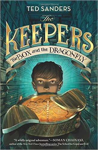
The Keepers: The Box and the Dragonfly by Ted Sanders
This is truly an amazing work of writing. I feel that is on par with Harry Potter, but mixed with science! Sanders creates an eccentric and mysterious world and plot embedded in our everyday real world. I felt a constant pull at questioning the motives of the characters...high recommendations for this book and worth every word! 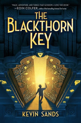
The Blackthorn Key by Kevin Sands
Set in the 17th century era of King Charles II, it has a unique sense of curiosity. Kevin Sands tackles integrating chemistry concepts in a fun, appealing and explosive way. The story mixes elements of friendship, parental love, religion and growing up to create a concoction that is truly rewarding. I have yet to start the second book in the series, but I am definitely hungry to read where Sands writes Christopher next. 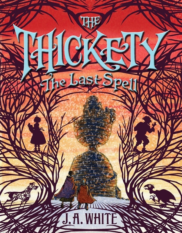
The Thickety by J.A. White
A witch-hunt in the world of children with magic balanced as the problem and solution. J.A. White authored an amazing fairy tale, three previous books, filled with intense emotion. I have been anxiously anticipating the final book for nearly a year and I devoured its pages with my eyes. The story follows a brother and sister as victims of a witch-hunt that turns into a mistake that could end the world. 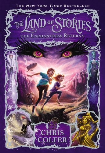
The Land of Stories by Chris Colfer
I am only on book two of this six book series. Fast paced adventure that does not leave the emotions behind, combine this with the rich retelling of some of everyone's favorite fairy tales and you have a golden egg of a series. Set in two worlds, the fairy tale world and the modern day world, the story follows twins Alex and Connor on quite an adventure in both worlds. |
||||||||||
